Great Design Is In the Cards For These Book Covers
Author Luke Epplin Taps Into His Love of Vintage Sports Cards to Design Covers For His Critically Acclaimed Books

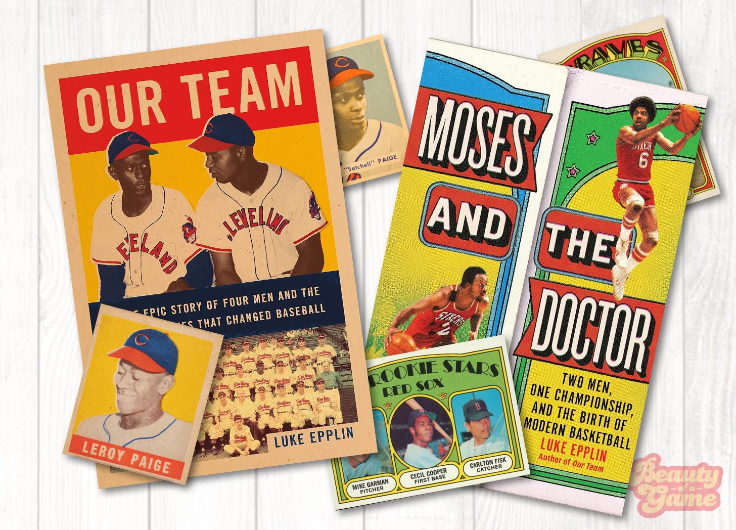
Last week, on social media, author Luke Epplin shared the cover design for his upcoming book, “Moses and the Doctor: Two Men, One Championship, and the Birth of Modern Basketball”. As with his previous book, 2021’s highly touted “Our Team: The Epic Story of Four Men and the World Series That Changed Baseball” the cover design will appeal to collectors of vintage sports cards. I reached out to Epplin, who was kind enough to answer a few questions I had regarding how he goes about having his book covers designed.
Beauty of a Game: You recently shared the cover design for your upcoming book, “Moses and the Doctor”. The cover takes strong design cues from the 1972 Topps baseball card set. Was this a conscious decision? And, if so, what made you or the designer want to use that card set as a design reference?
Luke Epplin: No, that wasn't a conscious decision. The book centers on two figures--Julius Erving and Moses Malone--who are polar opposites, both on and off the court. But when they came together on the Philadelphia 76ers, their opposing strengths and weaknesses balanced perfectly, creating a unified whole. So I wanted to find a way to visually represent their separation and connectedness. I turned to the 1980 Topps Basketball set, the one that has three players per card, separated by a perforated edge that you could tear off if you'd like.
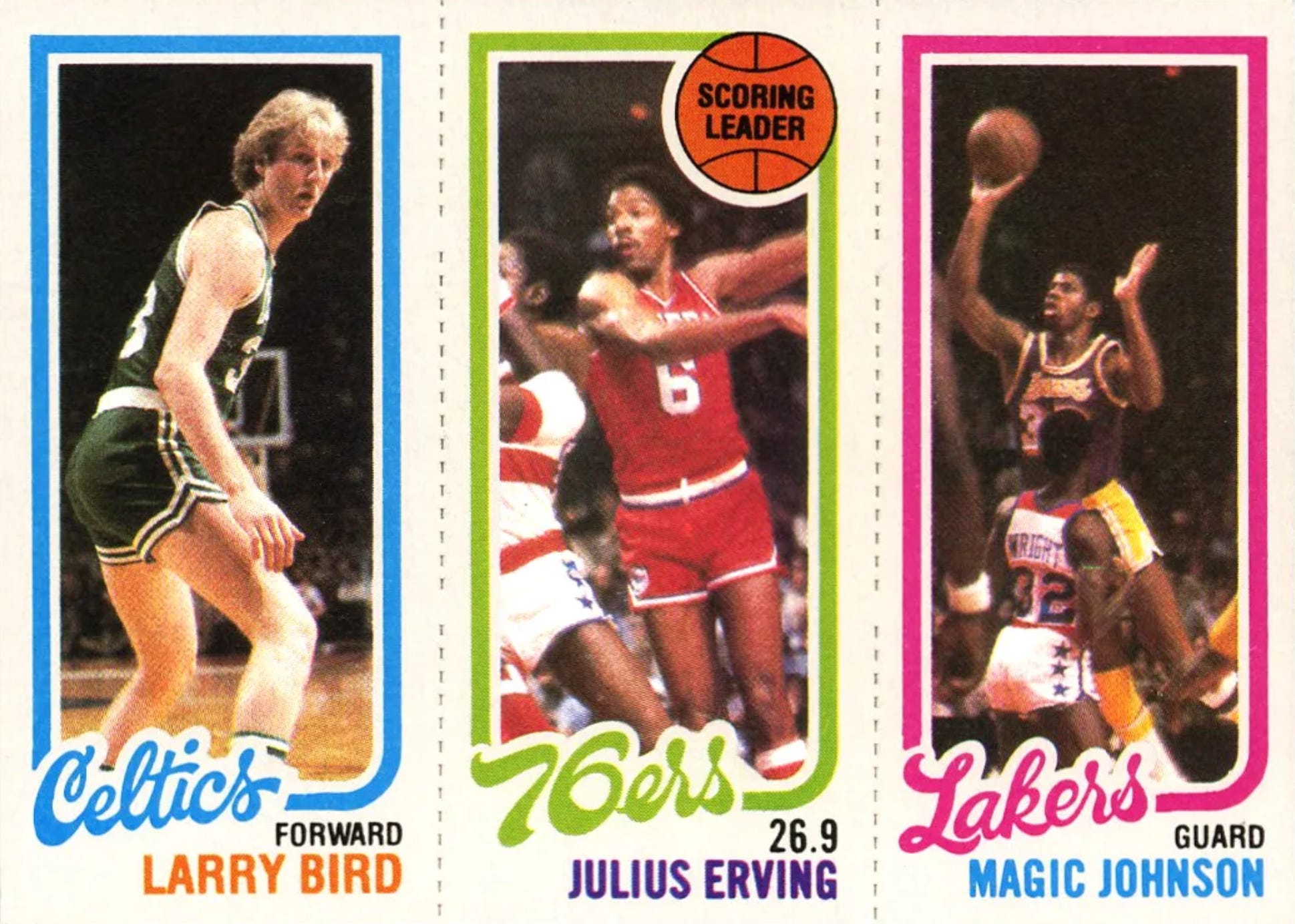
That way, Erving and Malone would be connected but also able to be separated. So I sent several images of Topps cards from that set to the cover designer. And I also asked him to use fonts and colors that bring to mind the 1970s/early 80s. So maybe he did find some inspiration from other cards from that era, including the 1972 Topps Baseball set.


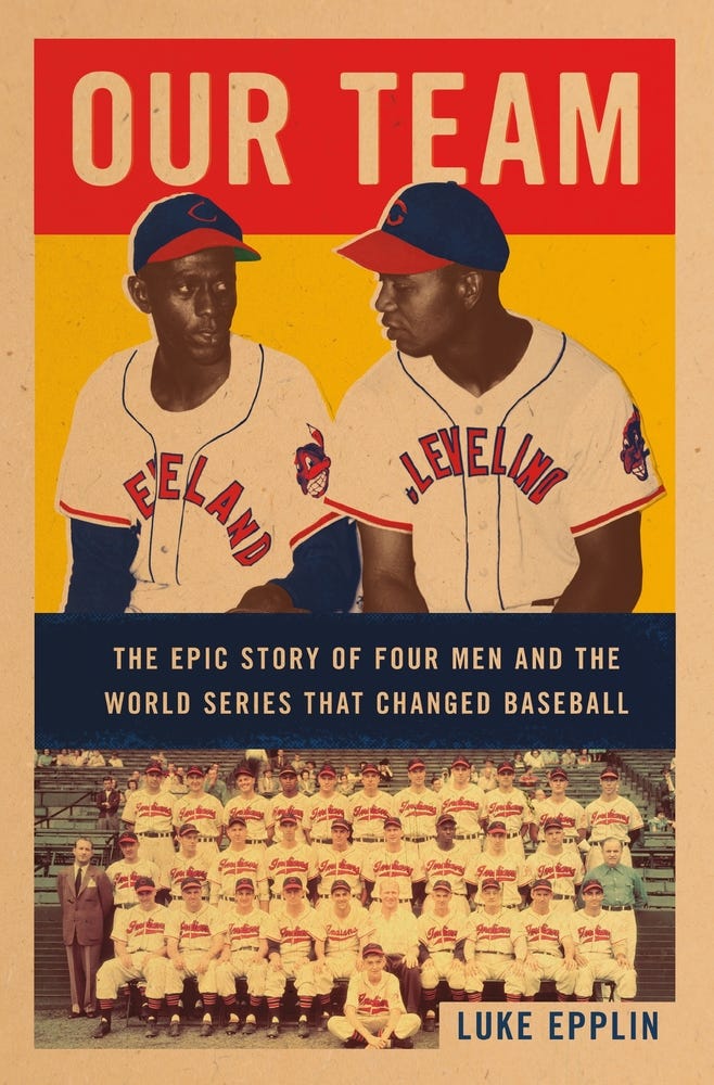
BofG: Your previous book, “Our Team” was a look at the Cleveland Indians teams of the late 1940s, and its cover took strong design cues from the cards of the 1948-49 Leaf baseball set. How did you come to that design for the cover?
LE: It was a very similar process. I knew that 1948 was a key year that baseball cards really broke into the mainstream, so I encouraged the cover designer to look to the 1948 Bowman and the 1948-49 Leaf set for inspiration. I also really loved those cards from the 1950s and 60s that showed an entire team, and since the title was “Our Team”, I thought that maybe showcasing the four main protagonists (Larry Doby, Satchel Paige, Bob Feller, and Bill Veeck) along with a complete team photo of the 1948 Cleveland Indians would work well. In the end, having four players on one cover was too busy, so we settled on Paige and Doby above the entire team.


BofG: So you’ve done two books, both with cover designs reminiscent of historic baseball card sets. Are you a card collector? If not actively, were you as a child?
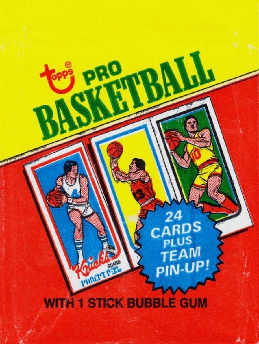
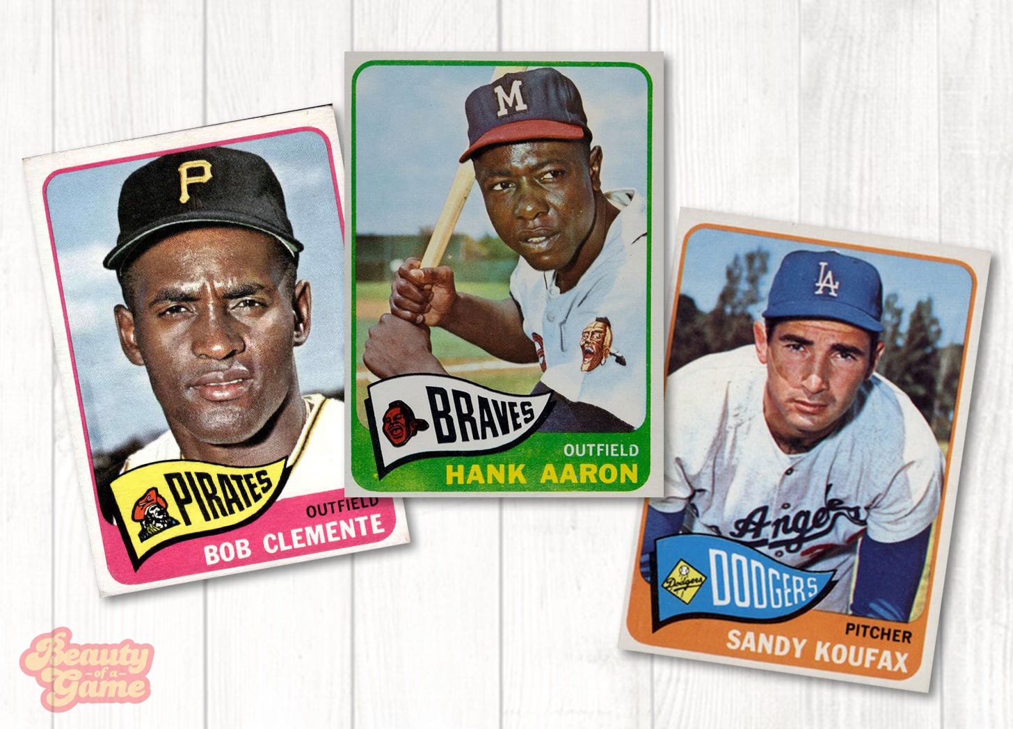
LE: Huge card collector. My father started collecting cards in 1952 and he kept at it through the 1980s. Luckily, his mother kept everything he had, so I grew up leafing through near complete sets of Topps cards from the fifties and sixties--incredible cards from Willie Mays rookies to Hank Aaron to Mickey Mantle. I too collected, but what I liked the most was that my dad and I used to grab certain sets--1965 Topps, say--and just flip through the cards. He sometimes would tell stories about what he remembered of certain players, so I gained an appreciation and knowledge of baseball history through baseball cards. It's a reason why I still have them all and cherish them.
BofG: Can you briefly explain the process used to design one of your book covers?
LE: Well, it's rather simple. My books are character based, so they focus on two to four individuals. In this upcoming case, the book is about Julius Erving and Moses Malone, so there was no question that the cover would feature photos of those two. There are plenty of photographs of Erving and Malone together over the years, but I wanted to steer away from a simple photo, which I consider to be a bit flat for a cover. I think that a cover needs to grab you and the way that that can happen is through either catchy design or an evocation of something that readers might be familiar with--in this case, sports cards from the era. So it starts with me presenting the idea to my editor. I sent him images of 1980 Topps Basketball cards and laid out the case for how something like that would resonate with the themes of the book. From there, the editor communicates everything to the art department at my publisher. It was very straightforward: they sent me several sample covers a month later, and the one that we ended up using was exactly what I wanted. I had no notes. He nailed it.
BofG: Have both books had the same cover designer? Do you pick the designer or is that determined by the publisher or editor?
LE: No, the publisher picks the cover designer. My first book was published by Flatiron Books and this upcoming one by Grand Central. So they each had a different designer.
BofG: Are you involved in the creative process as the designer works (seeing thumbnail sketches, reviewing proofs, etc.) or do you get a finished piece to approve?
LE: Not really. I've worked in book publishing my entire adult life, so I know that authors will be more likely to get what they envision if they provide specific notes, images, and comps for the designer to ponder. So I've always sent long emails trying to articulate what I would hope the cover might look like, along with images of baseball/basketball that I admire from the eras. I've been extremely lucky in getting designers who lock into that vision right away. Both covers came to me nearly perfect. I didn't see any need to futz with them. But I do know that that is rare. A lot of time, authors go through multiple rounds with the designer. Usually, the editor sends over the sample, the author and the agent mark them up, and then there might be several more rounds before they get to an acceptable cover. There are some authors who are tremendous at putting words on a page but at a loss when it comes to what they want visually. It's not easy, and many times the designer is the one who reads through the manuscript and pulls out images and ideas that might work. There's no right way.
BofG: Which is more fun, working on the book design or the blurbs for the cover?
LE: I find it easier to come up with ideas for the cover design than to write the jacket copy. That is so difficult. My next book is about 100,000 words, and it's really challenging to compress all of that into three paragraphs. Often, the publisher writes the jacket copy and sends it to the author to approve. In both cases, I elected to write my own copy. It's a good exercise and it helps me with the upcoming publicity rounds.
BofG: Any thoughts as to your next book? Or will you be looking through vintage baseball cards in hopes of sparking an idea?
LE: I don't know at this point. I have a couple of ideas. My first book was on baseball, and I loved the story so much that I didn't think that I could find a better story than that one. So I shifted to basketball. Lately, I've been drifting back to baseball. I would like to do something in that 1960s range, which would've been in the heart of my father's card collecting. I just know that period so well through those cards. Stay tuned.
A huge thanks to Luke Epplin for being so generous with his time and offering his insights for this article. Moses and The Doctor will be published on February 10, 2026 and is available now for preorders. Our Team is now available in paperback and E-book. Follow Luke Epplin on Bluesky and Twitter / X.