


Intro
This past Saturday, I had the opportunity to attend “Different Strokes for Different Folks: A Celebration of Baseball Card Art”, a virtual panel discussion presented in a joint effort by the SABR (Society for American Baseball Research) Baseball Card and Baseball & the Arts Committees. Besides being a great event in and of itself, it gave me a chance to pause and reflect on SABR, the state of baseball art in 2025, and where I’d like to see Beauty of a Game go.
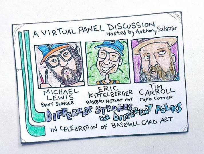
SABR Panel
The presentation was hosted by SABR member Anthony Salazar and featured baseball artists Michael Lewis (Mighty Lark) and Eric Kittelberger (Triple Play Design). Artist Tim Carroll was also scheduled to participate but was on the IL and unable to join in. Salazar gave a brief overview of both artists’ backgrounds and then ceded the floor to Lewis and Kittelberger in turn. Each artist presented a trio of works and discussed their inspirations and creative processes. As the presentation deck was completed prior to Tim Carroll going on the IL, his pieces were still included, with the moderator and other artists giving a brief overview of his work.


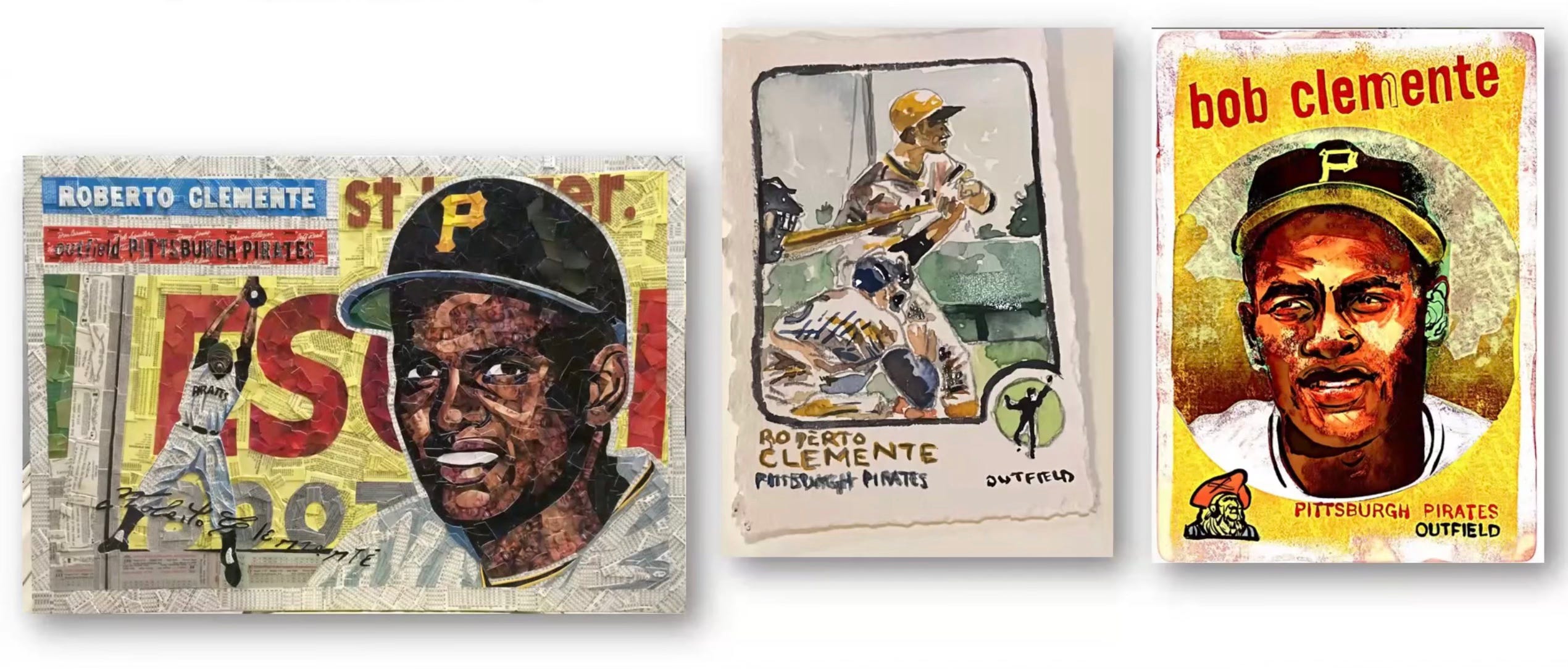
Following a brief comparison of Roberto Clemente pieces from each artist, Lewis and Kittelberger discussed each other’s works, asking questions and commenting on various pieces and techniques. It was a great chance to listen in as two great baseball artists talked shop among themselves. The session ended with several questions submitted by viewers.


The presentation and ensuing conversation were just the latest example I’ve witnessed of why it’s so great to be a SABR member. If you’re a baseball fan in any way, shape, or form, there is bound to be a committee that aligns with your interests in the game, and I encourage you to join today.
Although there was much to take away from such an insightful presentation, two things stood out to me and caused me to reflect on the state of baseball art and where (and how) I’d like Beauty of a Game to try and fit into this world.
Baseball Art in 2025
As Kittelberger and Lewis discussed their respective pieces of Roberto Clemente1, it dawned on me, “THIS IS WHY I LOVE BASEBALL ART!”
Artists bring their own perspectives, their own unique visions to each piece - interpreting the game and its heroes in their own style. If you’ve ever been in a bookstore’s sports section and wondered, “How can there possibly be that many books about baseball?” then you won’t be disappointed by baseball art in 2025. As many ways as there are to look at the game and discuss it literally, there are countless times as many ways that artists are interpreting it visually.
There are card artists, portraitists, cartoonists, designers, sculptors, photographers, and a slew of other artists doing stuff not easily labeled. And, to me, that’s what’s great. If you like baseball, there’s sure to be an artist (if not many) out there that appeals to you and your particular fascination with the game.
BofG - The Fort
Helping people find, understand, and appreciate those artists is where I hope Beauty of a Game can fit into this world. As Eric and Michael discussed each other’s art, inspirations, and techniques amongst themselves, I thought of The Fort.
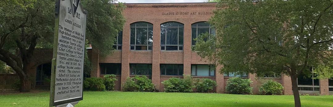
The Gladys C. Fort Art Building sits on the campus of Coker University in Hartsville, SC. It was there that I was first exposed to art as a verb, rather than a noun. Art majors had 24-hour access to The Fort (as it was affectionately called), and during my time at Coker, it was common for there to be people there at all hours of the day and night. At the time, the building housed Coker’s Fine Arts, Graphic Design, Photography, Illustration, and Art Education programs. So it was this huge melting pot of visual arts styles, all spurring each other on. And as young artists, we fed off this energy. Fine artists would come hang out in the design studios. Design students would drop in on illustrators to see what they were working on. And we’d all sneak into the photography dark rooms because, hey, dark rooms are fun2.
The Fort is what I’d like to try and fashion Beauty of a Game after. Although sports-focused, I hope for it to become a place where any manner of visual art can be not only found but also celebrated and encouraged. A place where, at least virtually, we can all gather around to look at, discuss, and cheer on sports art and artists. A place for those who want to be inspired and those who want to inspire.
I’ve been sharing and commenting on sports art on social media for a while now, but I believe Substack allows me to create this community. Although I’ve only scratched the surface of all it offers, there are various ways to make it more communal, more open to this idea of sharing. I’ll be setting up more of that in the future, but in the meantime, drop me a line or comment below. Do you know an artist you’d like to see featured? Know a photographer who’s shooting some really cool stuff? Heard about a sculptor doing phenomenal pieces? Send me names, links, info - whatever you got.
Thanks for reading, and I look forward to hearing from you.
Interesting note, in his works Carroll rights Topps’ wrongs by changing any “Bob” Clemente cards to Clemente’s preferred “Roberto” https://www.timcarrollart.com/bfgsdrppc28stcuhnzk2biot6g9uow
This was the early 1990s - photographers still used darkrooms, designers still used T-squares and Mac was something that went with cheese. By the time I graduated in 1994, this had all greatly changed.